Chargement…

Chargement du portfolio…
Case study · 2026
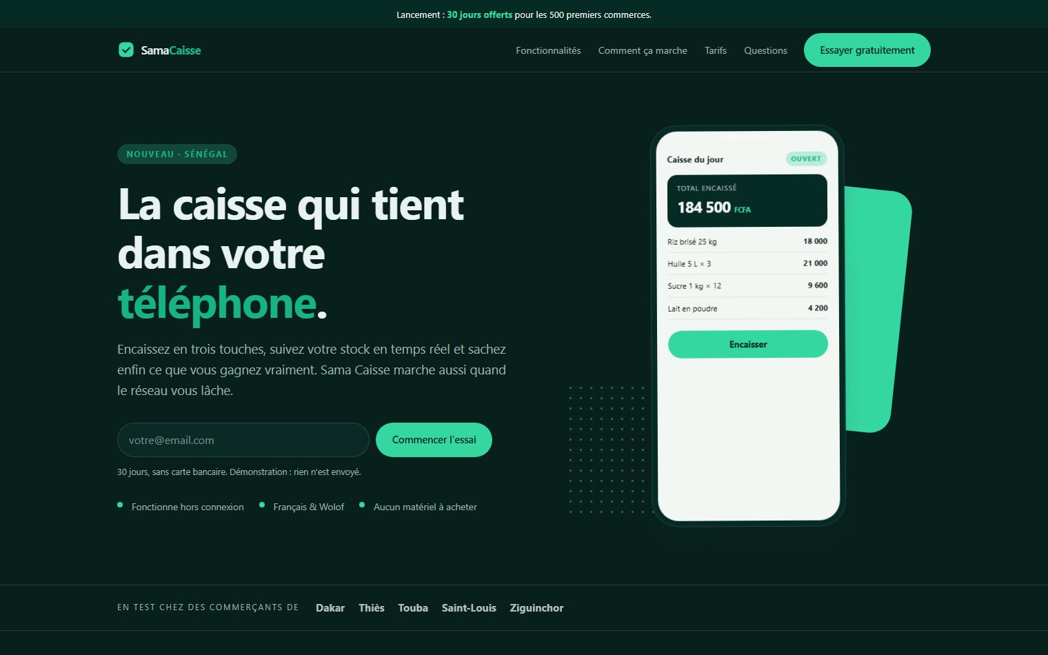
Conversion-focused launch page for a point-of-sale app: promise, proof, comparable pricing, FAQ. Live and browsable.
Client
Démonstration Zephyr
Year
2026
Services
Landing page · Conversion · Produit
A landing page demonstration: what we build when the goal is not to inform but to get a sign-up.
Structure follows the decision. One-screen promise, immediate email capture, then the problem as the prospect lives it before the solution as we propose it. Features come after, never before: nobody buys a feature list.
Readable pricing. Three plans, a monthly and yearly switch that updates the amounts without reloading, and the commitment stated plainly. The middle plan is highlighted because it fits most buyers, not because a badge looks good.
Details that matter. Sticky call-to-action on mobile as soon as the hero is passed. FAQ in native elements, so it opens without JavaScript. Phone mockup drawn entirely in CSS, no image to download.
The folder is self-contained and reusable for any launch.